
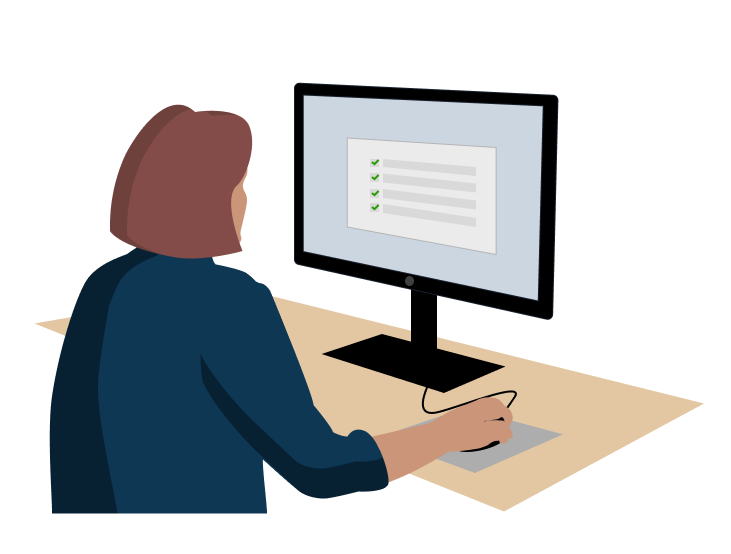
One issue with the web app was an inefficient management tool. Managers at an insurance company used a tool allowing them to generate reports about their team's workloads, including how many tasks each of their subordinates had completed and how many tasks still needed to be done. To use it, they filled out a form with parameters for the data reported, and then generated the report. However, managers performed this task several times a day, and found it repetitive and inefficient.
To address this, two new features were already planned: saving a report and scheduling automatic reports. However, usability studies with 5 managers and directors revealed that the designs were confusing. If the planned redesign were to go live, it would likely need to be redesigned once again, halting progress on the enterprise software as a whole. Using UX research to inform a new design could save the development team time and effort.
3 of 5
5 of 5
4 of 5
Key Findings
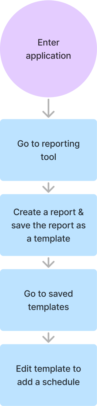
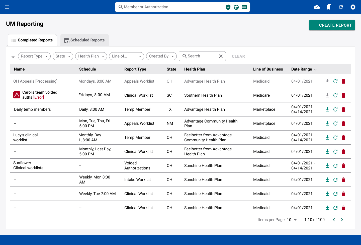
Scheduling Reports: Users didn’t know that to create a schedule, you need a saved template to base it on. You had to go to Saved Templates to create a new schedule, but instead, users went to the Scheduled Reports tab or Create a Report.
Viewing Reports Generated from a Schedule: Out of 5 users, 3 went to the Scheduled Reports tab first, 1 went to the Saved Queries tab first, and 1 found it on the first try (on Reports tab).
Save a Template: All users were able to save a template with no confusion, but 3 struggled to use the template.
Dots indicate Where Users looked To create a Schedule
Scheduling
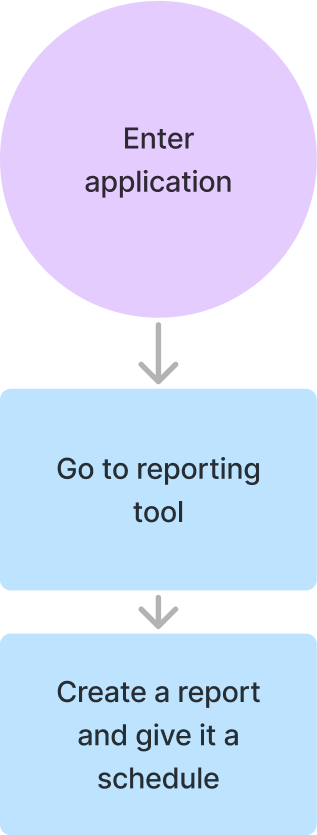
A click test showed that users mainly expected to find report scheduling in two places: the View Report Schedule section and the Create Report section. I chose to consolidate scheduling into the Create Report section. Overall, this streamlined the process, reduced clicks, and aligned with users’ mental models.
OLD Flow
Proposed Flow
New Home page
Saving a Template
Users could save report templates, but they struggled to find and use them in the Saved Queries tab. Because the feature was hidden and confusing, I replaced it with a more intuitive option: a “Re-generate” button in the action menu of each report. This opens the Create Report form pre-filled with the report’s parameters, making it easy to reuse any report as a template without needing to save it in advance.
Other Changes
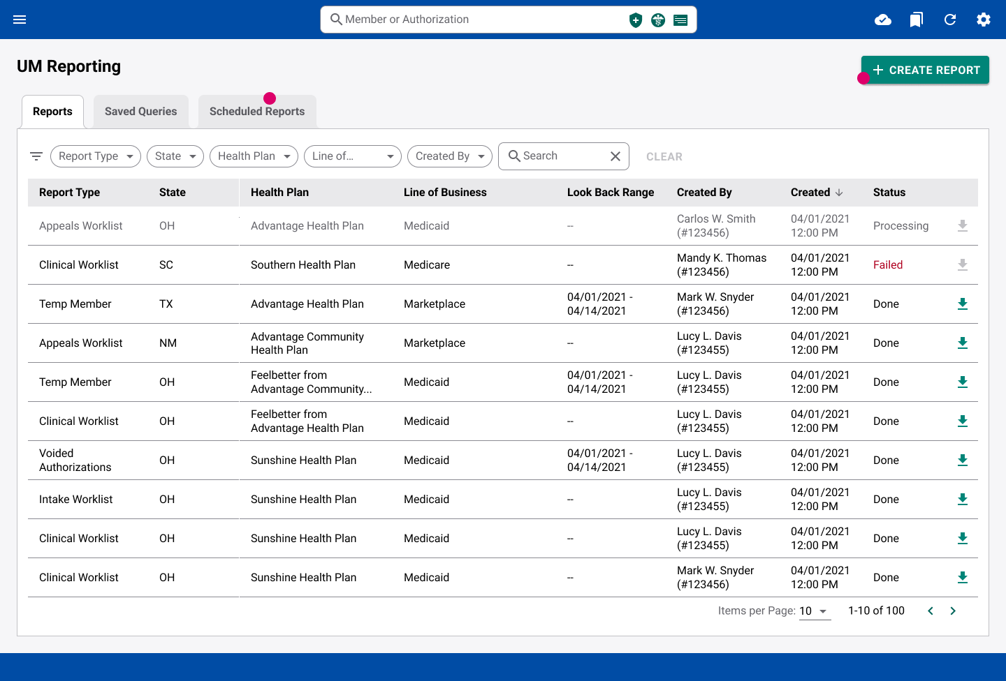
Viewing Reports from a Schedule: On the Completed Reports tab, users often couldn’t tell which reports were generated automatically, creating confusion about where to find them. To solve this, I added a dedicated “Schedule” column, replacing redundant fields so the interface stayed uncluttered.
Status Indicators: The original Status column wasn’t effective, so I moved status indicators directly into the report name for higher visibility. Reports in progress appeared grayed out with a “Processing” suffix, while failed reports displayed an “Error” suffix and an icon that displays more details when hovered. Placing these indicators on the left aligned with natural left to right reading order, making statuses easier to spot at a glance.
Results
4 of 5
5 of 5
5 of 5
Before handoff, I updated flow diagrams and annotated files in Figma to ensure clarity. During development, I joined sprint meetings to support developers, answer questions, and ensure adherence to the design system.
The redesigned flows increased first-try success rates, helping managers meet their workload and compliance requirements.
Given more time, I would hide the action buttons, only showing them when a report was hovered. This would help with cognitive load by giving the brain less information to sort through. Since according to users, recent reports tend to be the most useful, I would also bold reports that had not been viewed yet.
User research showed that the most intuitive places to schedule reports were the “view schedule” section and “create report” section. I picked one option as the solution. In hindsight, I would now choose to put scheduling in both places since both options were popular. This would allow users the freedom to choose the flow that is most intuitive to them.
Working in a UX-immature environment, I learned that in order to work with stakeholders, they needed to both trust me and feel ownership over the product. As a new member of the team, I built trust by inviting them to help create research plans and observe research sessions.